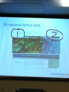
 Consumers don’t have time, and that makes it vitally important for your business to be clear about why they should buy from you. That was one clear message delivered by speaker Marie Wiese of Marketing CoPilot at a meeting of the IABC Professional Independent Communicators.
Marie shared some startling statistics for businesses with or without a website:
- Consumers are 70% through the buying process before a company ever hears from them.
- 97% of consumers will consult a website before they decide to buy.
- People will use 11.2 pieces of online data (which may include checking your website or your LinkedIn profile) to make a decision about buying something.
- 100% will go to your website before making a final decision to buy from you.
So, how good is your website at helping someone buy from you? Marie pointed out that your website can’t be:
- A one-way conversation, product spiel or online brochure.
- Oblivious to the buying process.
- All things to all people. (Marie particularly called out “homepageitis,” the tendency to cram every single thing on the home page.)
- An unconnected entity (you should have links to a LinkedIn and Twitter profile, Slideshare presentations, and/or other online presence).
- An unmanaged business process (you should know when your web address comes up for renewal, for example).
Here’s what Marie says is hot in websites:
- Understanding buyer behaviour and mapping it to your website. Good structure beats fancy design.
- A singular focus. People want less choice (three buttons rather than six), not more.
- Aiming for conversion rather than showing off how cool you are.
- Providing keyword-driven content based on your customers’ problems, not your products. You want customers to find you when they’re searching for solutions.
- Treating your website like a sales rep. Provide context; use video how-tos, for instance.
Marie described the 30-second website litmus test (shown above), where the eye goes first to the top left of the page (Where am I?), second to the top right (What can I do here?) and third to the middle (Why would I stay here?). Does your site answer those questions in those spots?
Suggested resources and references:
- Don’t Make Me Think: A Common Sense Approach to Web Usability, by Steve Krug
- The Art of Choosing (TED Talk) by Sheena Lyengar
- Copyblogger
- MarketingSherpa
- MarketingProfs
- Marcus Sheridan, “the Sales Lion”
- Download the 15-point Marketing CoPilot Web Presence checklist
- The Marketing CoPilot “Find Customer and Keep Customer” process wheel.

Sue,
Many thanks for writing this this review. I think you really got the essence of the presentation. In particular the key message that buyer behavior has changed so the same old product content is not good enough. Thank you for being a great contributor on the subject and spreading the word.
Thanks for commenting, Marie! I enjoyed your presentation and you gave us much to think about.