 The people behind the Air Canada Aeroplan rewards plan want to make sure members keep their information secure and up-to-date. I recently found this out because I was looking into turning some of my rewards points into gifts.
It’s been a while since I poked around to see what was available. Whether or not that was the reason, I had to reset my password and accept new terms and conditions before I could do anything with the points.
It’s rare to find any terms and conditions that aren’t full of jargon, legal terms and lengthy sentences that include multiple possibilities, don’t you find? These were no different. And you know me…
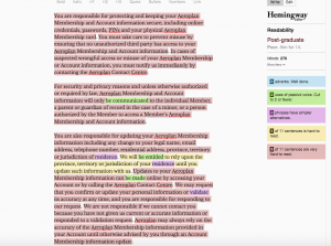
I chose one section of the new conditions and ran it through the Hemingway app, a test that measures how easy it is to read and understand a piece of writing. The app highlights wording that’s “very hard to read” in pinky-red; “hard” in yellow.
Although the section started off well, talking directly to the reader (“You”), it quickly fell into a sea of long, pinky-red, very-hard-to-read sentences. It rang in at a “post-graduate” reading level, best understood by readers of scholarly journals. Does Aeroplan WANT members to read this, or not?

I took a stab at rewriting this piece, using some classic methods of making something more readable:
- Use shorter, more familiar words. “Jurisdiction of residence” may be used for legal reasons, but the reader just needs to know “where you live.” If the Legal department insists on these words, insert an asterisk and link to the full, legal jargon elsewhere.
- Cut sentence length. Sentences of about nine to 14 words will be understood by 90% to 99% of your readers, according to the American Press Institute. The average number in the “before” section: 27.9, which would be understood by 50% to 59% of readers.
- Take out repetitive information. You don’t have to keep saying “your Aeroplan Membership Information;” you can say “this information.”
- Use the active voice. Passive voice (“information will only be communicated”) takes more words, is awkward and often hides who is supposed to be doing the action. There’s nothing wrong with “you” and “we.”
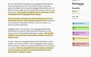
The result was much more readable, although phrases like “unauthorized person” and “validation request” keep it from being even better.

Here’s a comparison:
| READABILITY MEASURE | BEFORE | AFTER |
| Hemingway app ranking (Grade 11 = easily understood by 16- to 17-year-olds) |
Post-graduate “Poor. Aim for 14” |
Grade 11 “OK. Aim for 9” |
| Gunning fog index via StoryToolz (Reflects complex words, sentence length) |
Grade 21.3 | Grade 13.8 |
| Total words | 279 | 189, about one-third less |
| Average words per sentence (14 = up to 90% understanding) |
27.9 | 14.6 |
| Sentences that are hard to read | 1 of 11 | 4 of 13 |
| Sentences that are very hard to read | 9 of 11 | 0 of 13 |
As I’ve said before, making something easier to read has nothing to do with the brain power of your readers. It simply means you’re respecting their time and helping them get the point faster.
Have you seen a “before” piece of writing that needs an “after”? Please share in the comments or send me an email. I’m always looking for good (bad) examples.
Related reading:
Office 365 gets a name change
Google terms of service
How plain language makes complex writing more readable
