 Remember the old days, when you used to buy software and run it until it would randomly crash and other things started to go wrong? Then you’d upgrade, spend hours getting things working again, and then run it until the danger zone again because it was such a hassle?
Just me?
Software companies got wise and some, like Microsoft, switched to a subscription process. No more waiting for random disasters to upgrade, or stretching out your payments for a few years. Now, you’re continuously updating, whether you want to or not. I’m sure it’s a good thing.
Microsoft recently sent me a notice thanking me for renewing my subscription to Microsoft 365, adding that it was “successfully renewed, per your request.” This is amusing, because as I say, they automatically renew it every year, with no request or choice on my part.
This reminded me that as of earlier this year, the product I use is now called Microsoft 365 rather than Office 365. This seems to be tied to their first consumer offerings, and the post about it mentions – don’t laugh – “we’re always looking for ways to simplify. This new approach to naming our products is designed to help you quickly find the plan you need and get back to your business.”
Simplify? You know me. I had to look at the explanation of the name change to see how simple and readable it was. (This introduction is below; there was more about the specific changes and a reassurance that pricing and features wouldn’t change.) So I ran the introduction through the Hemingway app, a test that measures how easy it is to read and understand a piece of writing.
BEFORE:
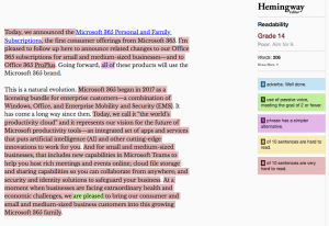
The Hemingway app gives the intro a Grade 14 rating (“Poor”), noting that six of 10 sentences are very hard to read (the pinky-red shading).
One of the easiest ways to make something more readable is to use short words and short sentences, and that’s where I started. I ditched some unnecessary words like “cutting-edge” (aren’t all innovations?) and “set of,” and split out the various “capabilities” (still not happy with THAT word, or the word “rich” applied to meetings) into bullets. I took out two instances of “I’m pleased to;” as with news releases, readers don’t care if the company is pleased or delighted. I also removed the line about “extraordinary health and economic challenges” in the last sentence. It’s not clear what that has to do with adding customers to the Microsoft 365 family.
AFTER:
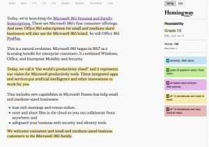
Don’t you feel less alarmed already? The red is gone and readability is a simpler Grade 10 level. This makes it easily understood by 15- to 16-year-olds – and the busy, impatient readers we all are. The somewhat hard-to-read sentences (flagged in yellow) could probably be shorter, but part of the problem is the “small and medium-sized business customers” phrase. Not much you can do with that.
Remember, aiming to make something simpler and easier to read is no reflection on the brain power of your readers. It simply means you’re respecting their time and helping them get the point faster.
Have you seen a “before” piece of writing that needs an “after”? Please share in the comments or send me an email. I’m always looking for good (bad) examples.
Related reading:
9 steps to readable writing, with turtles
A rewrite helps a long, red-flagged article get to the point
How readable is this piece of direct mail?