 Several times, I’ve taken part in a fundraising 5K event called Push for Your Tush. As usual with such events, I had to sign a release – actually a “RELEASE, WAIVER and INDEMNITY AGREEMENT,” in all caps every time it is mentioned – for the organizer, Colorectal Cancer Canada.
(Full disclosure: I’ve been doing this 5K since 2014, and I’m not sure which year I saved the text with the idea of running a “before and after” on it. Maybe the release has been updated since then, and certainly the many conditions likely became less necessary with virtual versions of the event.)
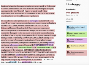
You know me. I had to run this AGREEMENT through the Hemingway app, which measures how easy something is to read and understand. The result is a great visual display of all the “very hard to read” sentences in a striking pinky-red shown here.
Oh dear. The app rates the wording at a post-graduate, scholarly-journal-type level, whereas the average adult reads at a Grade 8 level. (“Poor,” scolds the app.) Nine of 12 sentences are very hard to read. Notice the second paragraph, almost entirely taken up by one long, guaranteed unreadable 119-word sentence.
Now, I know lawyers phrase things a specific way in these AGREEMENTS to cover every possible situation. Still, if you want someone to know what they’re signing, make it simple, easy to read and understandable. Then put the full and binding legal detail in the fine print at the bottom of the page, or link to it somewhere else. That way, the lawyers can include all the “prior to, during or subsequent to” and “HOWSOEVER CAUSED” and “whether in law or equity” phrases they like.
Making something simpler and easier to read is no reflection on the brain power of your readers. It simply means you’re respecting their time and helping them get the point faster.
I rewrote the AGREEMENT using these easy ways to make it more readable:
- Use more familiar words. “Abide by all rules, regulations, and instructions” may be used for legal reasons, but “follow the rules” sums up all the reader is going to understand anyway.
- Cut sentence length. Sentences of about nine to 14 words will be understood by 90% of your readers, according to the American Press Institute. Anything over 43 words? Zero to 9%.
- Take out repetitive information. Eyes will definitely glaze over at “claims, demands, damages, costs, expenses, actions and causes of action.”
- Use the active voice. Passive voice (“may have been contributed”) takes more words, is awkward and often hides who is supposed to be doing the action.
- Don’t use ALL CAPS, which are harder to read and make you look like you’re yelling. If you want to emphasize a word, use bold.
Check out the May issue of Wordnerdery for a look at how I rewrote the AGREEMENT. The new version is about half the length of the first, with zero sentences very hard to read. It comes in at a readable Grade 7 level. (“Good,” praises the app.) There are no alarming ALL CAP directives.
Have you run across a “before” that needs an “after”? Do share. I’m always looking for good (bad) examples.
Wordnerdery is a quick read about words, effective/expressive writing, newsletters and more. Are you a subscriber yet? If yes, thanks for reading! If not, you can sign up right now. In keeping with Canada’s anti-spam laws and just plain good manners, you can easily unsubscribe any time.